How to Build a Homepage that Sells
Website builders like Squarespace provide an easy way to start with zero technical skills. But building a polished website that sells requires some "magic" 🪄, or at least some additional effort. You wonder what? Just keep on reading…
I'll share a secret with you:
People don’t buy because of who they are.
They buy because of who they want to become.
So our main goal is to make them dream of a better version of themselves.
Let's begin 👏
To be effective, a website should have at least 4 pages
✔️ HOMEPAGE: Your front door
✔️ SERVICES, preferably with a separate page for each service we provide: Here we offer educational information which will strengthen our expert position
✔️ ABOUT PAGE: Your (personal) story, area of expertise, specialties, and subspecialties
✔️ CONTACT PAGE: How your customers connect with you
✔️ Bonus - BLOG: There you provide free educational content and support our SEO (search engine optimization) efforts
As the HOMEPAGE is the place most visitors would land, here we need some of that "magic". Ideally, in order to sell, your SERVICES pages should have similar structure to your homepage.
How to build a Homepage that sells
Here are the guidelines we'll cover
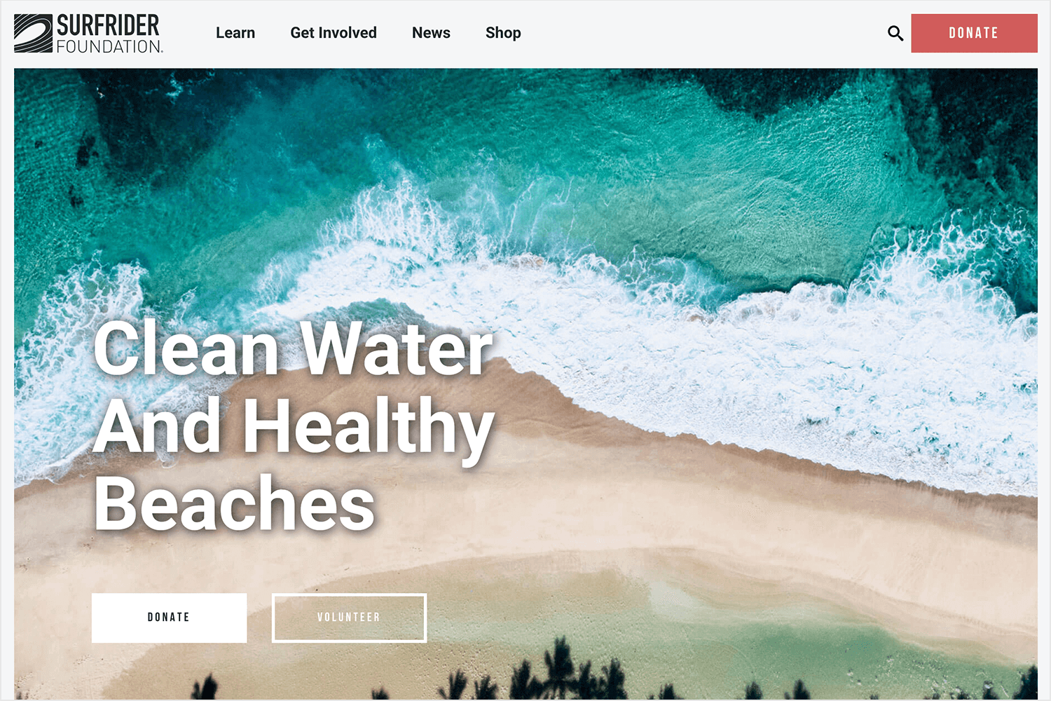
👉 1. Use relevant and emotional hero image (or video)
👉 2. Provide strong Headline and make them Dream
👉 3. Include Call-to-action buttons
👉 4. Include testimonials, ⭐5-star reviews or client results
👉 5. State your certifications and experience
1 // Use relevant and emotional hero image (or video)
A Hero image is a large, attention-grabbing picture (or video), shown as the first thing at your website, just below the header, typically taking up the whole pre-scroll area of the page.
This section is extremely important - in fact, it takes only about 50 milliseconds (that’s 0.05 seconds) for users to form an opinion about your website. That’s all the time it takes someone to decide whether they like your site or not, whether they’ll stay or leave.
Again, with our hero image, we’re looking to complement our offer and create a strong first impression.
Here are few things to consider when choosing your hero visuals:
Provide knowledge and information: presenting what you do or the end results of your services
Provoke feelings in visitors: try to shape the mood, to make them dream of a BETTER future self ✨
Never forget aesthetic pleasure: quality is king. Best case is to have professional or semi-professional photography of you or your services. You could complement that with stock images - here are some great FREE sources - Top 6 Go-To Sources for High-Quality Free Stock Photos
2 // Provide strong Headline and make them Dream
We can use one good example from our blog post 6 Inspiring Therapist Websites Built With Squarespace
Shout-out to The Therapy Group
"you DESERVE to LOVE your LIFE"
a healing space for individual, relationship and family therapy
Here is a list of emotions we could try to evoke when creating a strong headline
joy
empathy
empowering
belonging
security
freedom
Here is another one from Nephesh Pilates that incorporates feelings of empowerment and freedom.
"The Work-out your body NEEDS to LIVE the LIFE you WANT."
We're a Pilates studio in East Sacramento that can help you move and feel your best.
3 // Including Call-to-action buttons
How does a visitor become a customer?
Imagine you're the visitor and you're instantly hooked to the offer - we do not want to let you browse around - we should motivate action NOW.
Having relevant, eye-catching and provoking Call-to-action buttons and/or section is one of the most important aspects of our homepage.
70% of small business websites lack a clear Call-to-Action and as a result have bad conversion rate (e.g. turning visitors into customers).
Here are some examples of good, converting Call-to-action wording:
"Get in Touch"
"Join now"
"Schedule an Appointment"
"Book a Free Call"
"Subscribe" - to a social media, to a newsletter or blog feed
They should be eye-catching. If you want someone to click on your CTA (that’s Call-to-action), they have to notice it first. Use bold, contrasting colors, and make it large enough to stand out on your webpage.
Best case is including Call-to-action buttons in multiple places in our Homepage. Different sections could have different call-to-actions - for example a Services section could invite visitors to "Explore more".
4 // Include Testimonials, ⭐5-Star Reviews or Client Results
Testimonials and reviews can be big part of the "magic" when it comes to attracting new customers.
Social proof is a psychological phenomenon when people conform to others to feel like they fit in or belong. In other words, we are more likely to do something if we see that other people are doing it too.
When we see happy customers stating how great a service or a specialist is, we want to try it ourselves. After all, if all these clients love it, it must be good, right? We provide a first-hand account of somebody else’s experience with a product or service.
Here are some ideas for testimonials that you could use.
Psst: Don't forget to ask for consent and don't be fake 😉
Circle includes a few different types of testimonials on their homepage. Those could be reviews from Google and Trustpilot or Comments in social media.
Fabletics include social media posts, showcasing results, including their #hashtag
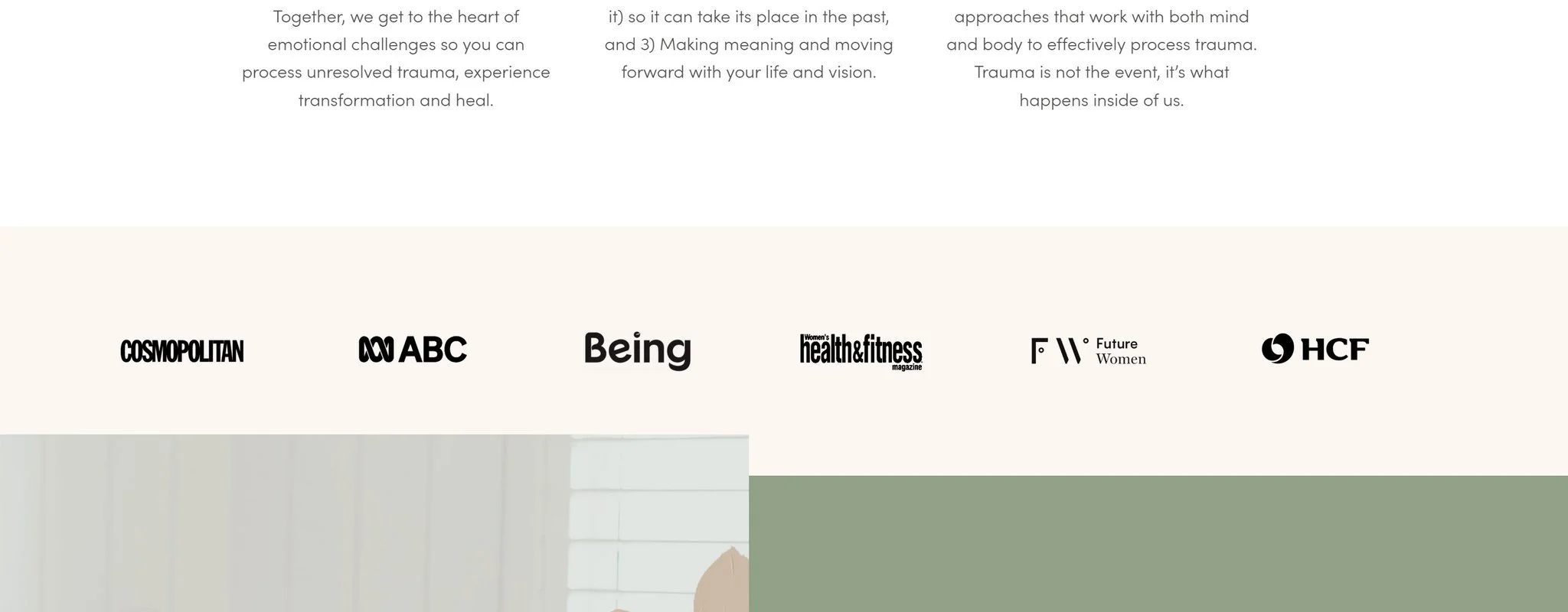
Natajsa Wagner Psychotherapy and Counselling presents logos of organizations the business have worked with.
5 // State your Certifications and Experience
Certifications help us build instant trust and credibility.
They serve as evidence of our expertise and commitment to professional development. This can set you apart from others in your field, enhancing our image in website visitors, who lack other information about our level of experience.
Here is a good example from Natajsa Wagner Psychotherapy and Counselling.
💥 The Short of It
Build a Homepage that sells, following these guidelines
👉 1. Use relevant and emotional hero image (or video)
👉 2. Provide strong Headline and make them Dream
👉 3. Include Call-to-action buttons
👉 4. Include testimonials, ⭐5-star reviews or client results
👉 5. State your certifications and experience


