5 Website Mistakes You’re Making and How to Fix Them

Your website is your business’s digital front door. So why let common mistakes turn visitors away? From unclear messaging to poor design, these weakspots can make the difference between someone staying or leaving in seconds.
In this post, I’ll walk you through some of the biggest mistakes I see on websites and, more importantly, how you can fix them. Let’s dive in and make sure your site is doing exactly what it’s supposed to - converting visitors into happy customers.
Mistake #1 - Unclear Messaging
"What's in it for me?"
That's the first thing people think when they land on your website. So, you need to instantly capture their attention and keep them scrolling down. If your message is vague or buried under too much text, you risk losing them in seconds. So don't try to be smart, literally TELL THEM in a clear way:
What you offer / What your business does
Who it’s for
How it solves their problem / How it helps / What value it provides
This means ditching the industry jargon or overly complex explanations. Instead, use simple, straightforward language that speaks directly to your customer’s needs. Remember, clarity beats cleverness every time.
Let me give you an example. Imagine you’re the owner of a yoga studio called "Blissflow Yoga Studio" (I'm totally making this up). You offer online classes. Your ideal client is busy moms who are juggling work, kids, and personal well-being. Now let’s craft a message that will emphasize self-care and time management - all things that might resonate with this particular audience.
🙅 Example of unclear, badly written message 👇

Ok, what makes the above message example bad? Both the headline and subheadline are filled with poetic, abstract language. “Inner light” and “unlock your potential” are fluffy terms that don’t speak to moms’ practical desires like stress relief, flexibility, or fitting yoga into a packed schedule.
👌 Example of clear, well crafted message 👇

Why is the second message a good one? It works because we've made the audience very specific: “busy moms” instead of just anyone. We’ve also addressed their pain points: managing stress and recharging their energy while juggling multiple roles.
Start with the right words, then make your message visually obvious too. No one should have to dig through paragraphs to understand what you do. This is why your core message should be front and center, ideally above the fold (the part of the screen people see without scrolling). Keep these in mind:
Contrast & balance
Text hierarchy
Readable fonts
Relevant, compelling images
Add a strong call-to-action, and you’ve already made it easier for people to engage with your site.
Mistake #2 - No Clear Call-to-Action (Or None at All!)
What is a Call-to-Action anyway?
In case you wonder, a call-to-action (CTA) is simply a prompt that tells your website visitors what to do next. For example: “Book a Class”, “Sign Up for Our Newsletter”, or “Get Started Today.” Sounds obvious, right? Yet, so many websites either don’t have a clear CTA or forget to include one altogether.
Here’s the thing: people need guidance when browsing a website. If there’s no obvious next step, they won’t go searching for it, they’ll just leave. Instead of assuming they’ll figure it out, spell it out for them. Here are a few examples:
Want them to book a class? Literally tell them to book a class. You can say something like: “Book Your First Class Now”
Need them to sign up for your newsletter? Make it obvious. Use some text like “Get Weekly Tips. Subscribe Here”
Selling a product? Guide them to it. Insert a button that says “Shop Now”
And don’t just throw one CTA at the bottom of the page and call it a day. Every page should have a clear action. Whether it’s a button, a link, or a bold headline, make sure visitors always know what to do next.
💡 Pro Tip: Make your CTAs stand out! Use contrasting colors, clear wording, and place them where people naturally look, like above the fold or at the end of key sections.
Look at the example below. Calm’s homepage is beautifully clean and simple. The CTA, in this case “Try Calm for Free” is very clear and obvious. Nicely done! 👌
Source: www.calm.com
Remember, if you’re not telling visitors what to do, they probably won’t do anything at all! A strong, clear CTA makes all the difference.
Mistake #3 - Too Cluttered
When I say “cluttered”, I mean too much text, no clear sections, a million menu options, basically chaos. It’s overwhelming! Instead of guiding visitors smoothly, a cluttered website leaves them feeling lost, frustrated, and more likely to click away.
Clutter can take different forms, but here are the two biggest mistakes:
👎 Walls of Text (Nobody Reads Paragraphs Like a Novel)

Have a lot to say? Do it! Just don’t make your website visitors fall asleep with super long paragraphs aka “walls of text” 😴 The truth is people don’t read, they scan. If your website is just a giant block of text with no breathing room, visitors will struggle to find the key info they need. So here’s how to fix it:
Break up text with headlines & bullet points (just like this!)
Keep paragraphs short, 2-3 sentences max.
Use bold & highlights to make key points pop.
Make important info stand out—don’t bury it!
Include photos or graphics to make it more interesting.
👎 Clunky, Confusing Navigation

Ok, what’s wrong with this example? First of all, the logo is too big! The otherwise beautiful typography is taking too much space and it looks like it’s screaming at you. Then we have too many links. Does “Private Facebook Page” really needs to be here? “The Woman Behind the Stories” is too long and could have simply be “About”. Sorry, Rose.
Too many tabs, dropdowns, and hidden menus make it hard to find anything. If users have to think too much about where to click, they’ll probably just leave. Instead:
Stick to a simple, clear navigation menu. Aim for 5-6 main options.
Use intuitive labels (like “About”, “Services”, "Contact" etc.) instead of clever but confusing names. “My Life Journey” might sound poetic but it would be much better to use a normal human word that people actually understand, which in that case would be simply “About”.
Don’t end up with the logo taking half of the screen. It steals the attention from the important stuff.
A cluttered website makes people work too hard to find what they need, and guess what? They won’t. Keep it clean, easy to scan, and simple to navigate. Your visitors (and conversion rates) will thank you!
Mistake # 4 - Not Optimized for Mobile

Let’s be real, most people are visiting your site from their phones. If they have to pinch and zoom, struggle to click tiny buttons, or deal with a layout that just feels off, they’ll leave in seconds. I know I would. So how to fix this?
Use responsive design, meaning your site should adjust smoothly to any screen size.
Make buttons & links easy to tap (because no one likes struggling to click tiny text).
Keep text readable by using a comfortable font size.
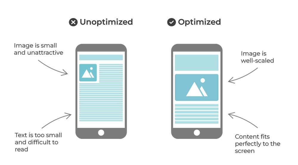
If you’re in doubt, test it! Visit your site on different phones and tablets. Is it easy to use? If not, time for some tweaks!
Mistake # 5 - Slow Load Times

Nobody likes waiting for a website to load. In fact, if your site takes more than a few seconds, most visitors will hit the close button and never return. A slow website isn’t just frustrating. It’s costing you traffic, leads, and sales. Here are a few things to watch out for:
Huge sized images. Before uploading images to your website, make sure you compress them. My favourite online tool is compressjpeg.com
Excessive animations & effects.
Too many plugins. Keep only what’s essential.
💡 Pro Tip: Run your site through a tool like Google PageSpeed Insights to see what’s slowing it down and get specific fixes.
Don't Be One of Those Websites
Use these five tips to improve your website and avoid common website design mistakes (like those other guys). Here’s a quick recap of what to focus on:
Make your messaging clear – Say what you do, who it’s for, and why it matters. Without the fluff.
Guide visitors with strong CTAs – Don’t leave them wondering what to do next. Spell it out.
Keep it clean and easy to navigate – Ditch the clutter, break up text, and simplify your menu.
Optimize for mobile – Your site should look great and function perfectly on any device.
Speed it up – A slow website is a dead website. Keep it fast and efficient.
Hire a Squarespace Web Designer
A great website isn’t just about looking good. It’s about working for you. If you’re feeling overwhelmed or unsure where to start, I can help! As a Squarespace web designer, I specialize in creating clean, high-converting websites that look great, work smoothly, and actually help your business grow. 🌟
Ready to take your website to the next level? Let’s chat! Get in Touch Today.