7 Therapist Logo Examples + Design Tips for Success
A well-designed logo can evoke emotions, build trust, and make a lasting impression on clients. In this article, we'll take a look at 7 different therapist logo examples to inspire you and we’ll also go through a few design tips to help you create an impactful logo for your counseling or therapy business.
Crescent Counseling
Starting the collection with this beautiful logo design I created for Amanda and Allison - therapists at Crescent Counseling who are passionate for cultivating healing in their Dallas community.
We came up with an elegant image of a crescent moon, not only inspired by the brand name but also full of symbolism. The branches represent the therapists who hold a safe space for the person looking for support.
Take a look at the full project here.
Find the Silver Lining Counseling
Jamie is a mental health professional who owns a private practice - Find the Silver Lining Counseling.
As the brand name speaks for itself, we wanted the logo design to include a cloud with silver linings as symbol of looking for the positive in all situations.
Affirmation Counseling
Another logo design concept for a mental health therapist.
It incorporates an image of a spiral combined with botanical elements. Why a spiral? A spiral represents continuous growth, evolution, and transformation. It symbolizes the journey of personal development and can visually represent the process of affirmations leading to positive change.
The leaves are another element that symbolizes growth and reinforces the metaphor for transformation.
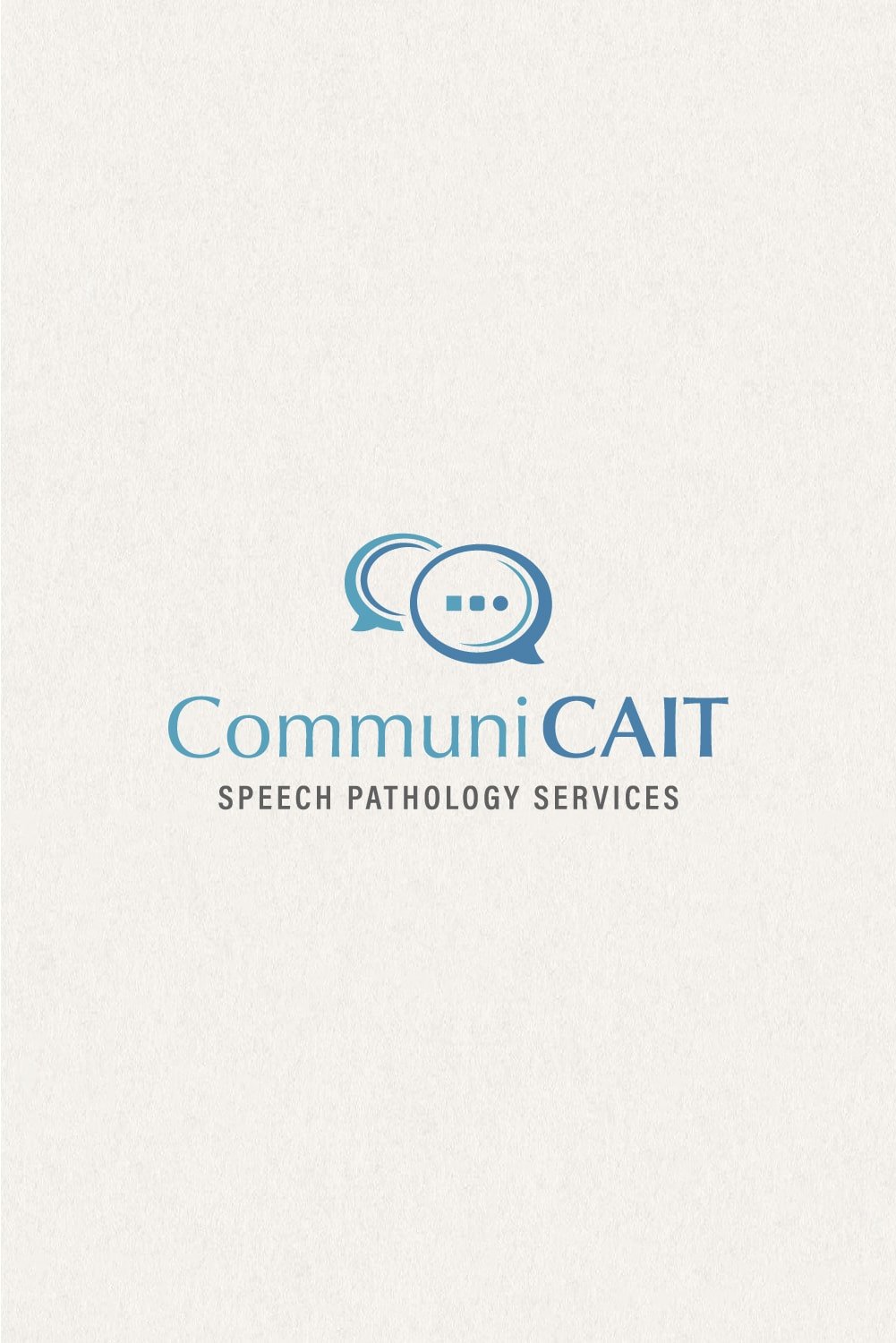
CommuniCait Speech Therapy
Caitlin helps people to communicate again. She’s a speech therapist who works with patients to improve their speech, language, cognition, or voice after they experience a stroke, brain injury, or other disorder.
The logo design features speech bubbles in oval shape so that they appear more friendly and approachable. Inside the big bubble instead of the three dots we're used to see in a speech bubbles there's actually three different shapes - a square, a square with smooth edges and a circle, representing transition or progress (such as patient's progress of communicating and speaking more smoothly thanks to therapy).
MLB Therapy
Michelle is a therapist who provides therapy for families, adults and groups. Within her work, she helps clients seek balance and healthy boundaries within their relationships as well as within the multiple facets within their lives.
The logo incorporates an image of a tree showing its roots under ground. As Michelle said, that symbolizes one's history or family history. It could also be perceived as a symbol for personal growth. The trunk of the tree resembles a human silhouette which intensifies the metaphor even more.
Lifewise Mental Health Therapy
Logo design concept for a concierge therapist who helps her clients attract and build relationships that are good for them, handle difficult situations, and spend more time enjoying life and work.
The logo design includes a sun icon as symbol of life and all things positive. Done in warm shade of “gold” to inject some extra positive vibe.
Soul Care Counseling
Soul Care is a counseling practice concept brand.
The logo design includes an image of a lotus flower accompanied by the sun that shines behind it. The sunrise stands for hope, new beginnings and positive attitude.
The lotus flower is another powerful symbol associated with life. It could be perceived as a metaphor for the journey of spiritual growth, or to signify strength, resilience, and overcoming obstacles, an idea that comes from its ability to emerge from murky waters and blossom into a stunning flower.
4 Things to consider if you strive for a great logo design for your therapy or counseling practice:
Relevance
Memorability
Simplicity
Versatility
1. Relevance
Make sure your logo reflects the essence of your therapy practice. This can be done in a literal or abstract way. For example, if you're a mental health therapist this doesn't mean your logo should necessarily include an image of a brain. That's only one way to do it. You can also think of ways to base your logo design on an emotion you want to evoke in your clients. Another thing you can do is incorporate elements that resonate with your values or something symbolic about your approach.
2. Memorability
Strive for a unique memorable design that stands out. A logo that sticks in people’s mind helps them remember the brand better. It leaves a lasting impression, and fosters a stronger connection with your audience.
3. Simplicity
I'm a big believer of the "less is more" philosophy. There's no need to distract people with decorations just for the sake of it. Simplify your logo to its core elements without sacrificing its essence. A simple design is easier to remember, versatile in application, and more impactful in communicating your brand message.
4. Versatility
Design a logo that looks good across various mediums, sizes, and applications. How to do that? By creating different logo variations. This way your logo will remain effective whether displayed on a website, business card, social media profile or any other place. If you want to learn more about logo variations, check out this post.


